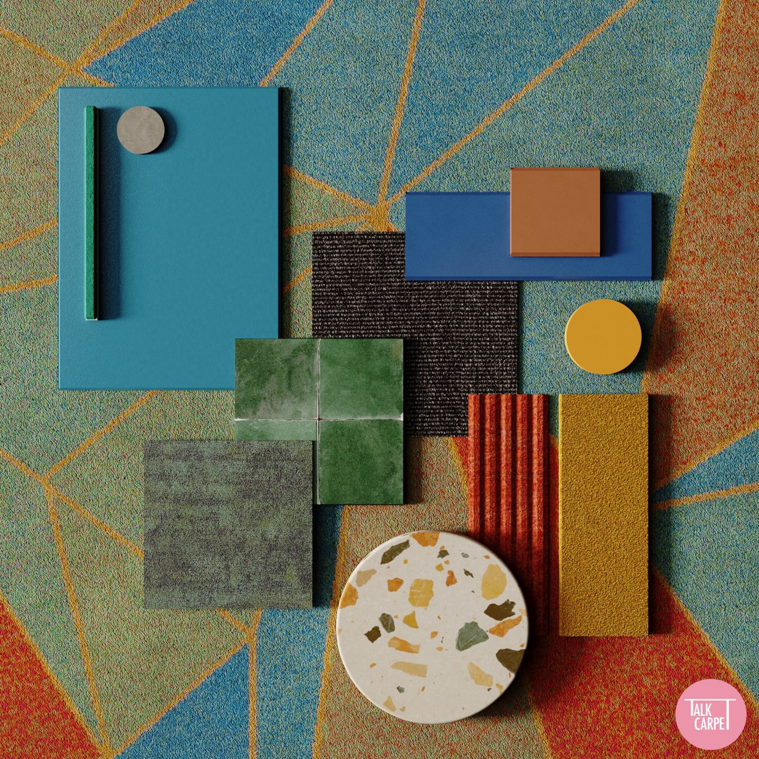
One way to pack a visual punch into an interior is to incorporate bold and vibrant colors. This is a common design technique used to add life and soul to a space. The addition of color creates emotion, drama, and depth. And the color choice has huge effects on the overall atmosphere of the room. Choosing the correct shades and hues and using them in a sophisticated balance gives the designers the ability to evoke whichever emotion they desire. We’re putting our money on trending interior colors that are bold and vibrant.
Over our past year spent traveling, we have seen the use of bold colors across all corners of the globe. This article looks at some of our favorite environments worldwide that have influenced this design movement. We then discuss bold color in incredible interiors, from restaurants in Madrid to recording studios in Johannesburg. Finally, we share our take on this trend with some custom carpet ideas and mood boards put together by our creative team.
Vivacious Spanish Streets Full of Life
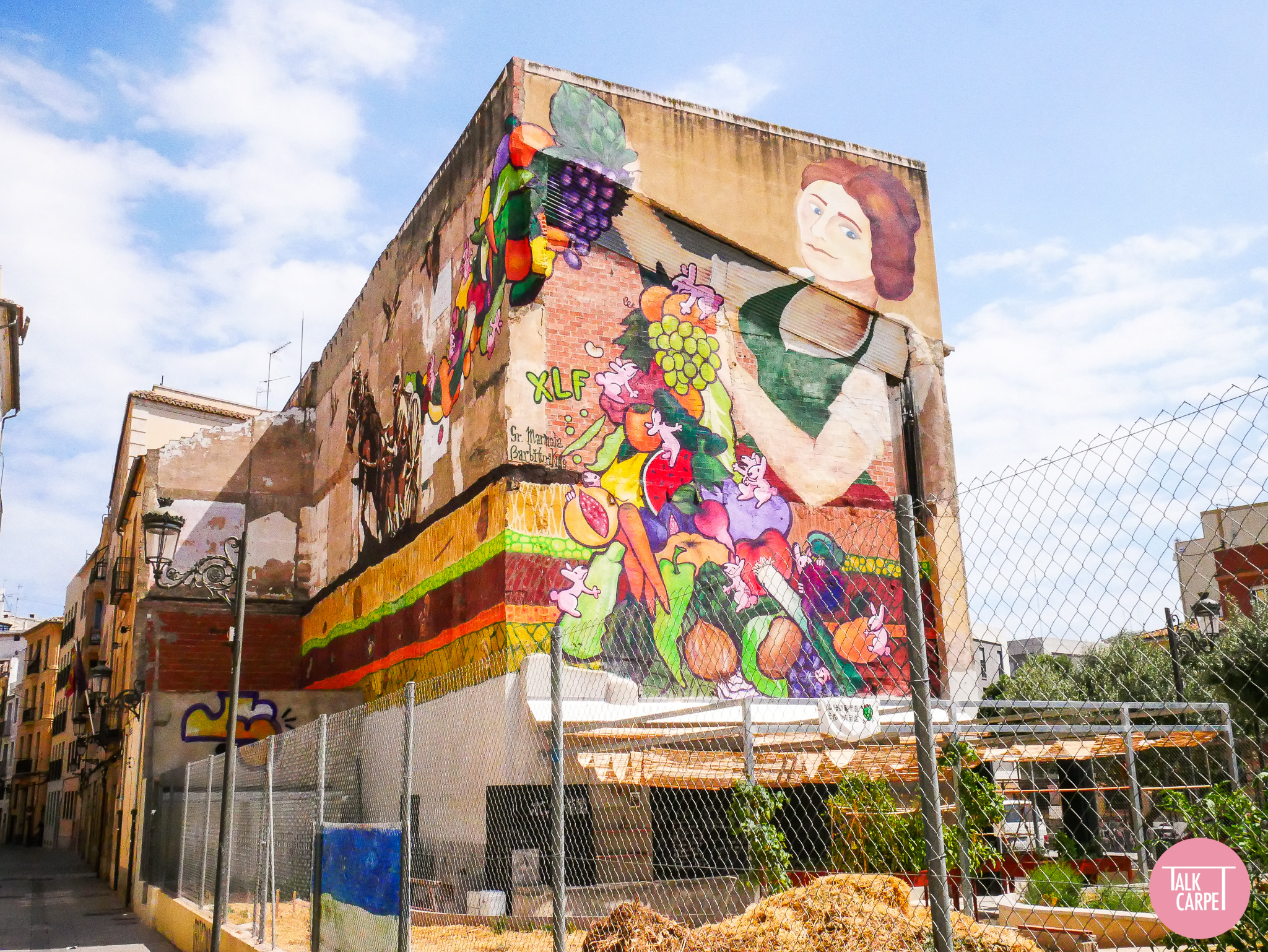
Bright colors may not be found in abundance naturally, with nature taking more earthy and muted tones. However, you won’t have to look far to see the use of bold colors in the world around us and in trending interior colors. In particular, Spain is a key player in this design trend. One of our favorite examples is the urban artwork found in Valencia. The murals in the city are some of the most beautiful we came across on our travels. From graphic, geometric, vibrant patterns to more elaborate pieces reflecting societal issues, the theme of the pieces vary. However, each uses bold color to stand out from its stone walls and convey its message to observers. The street art adds an instant injection of character, personality, and artistic expression.
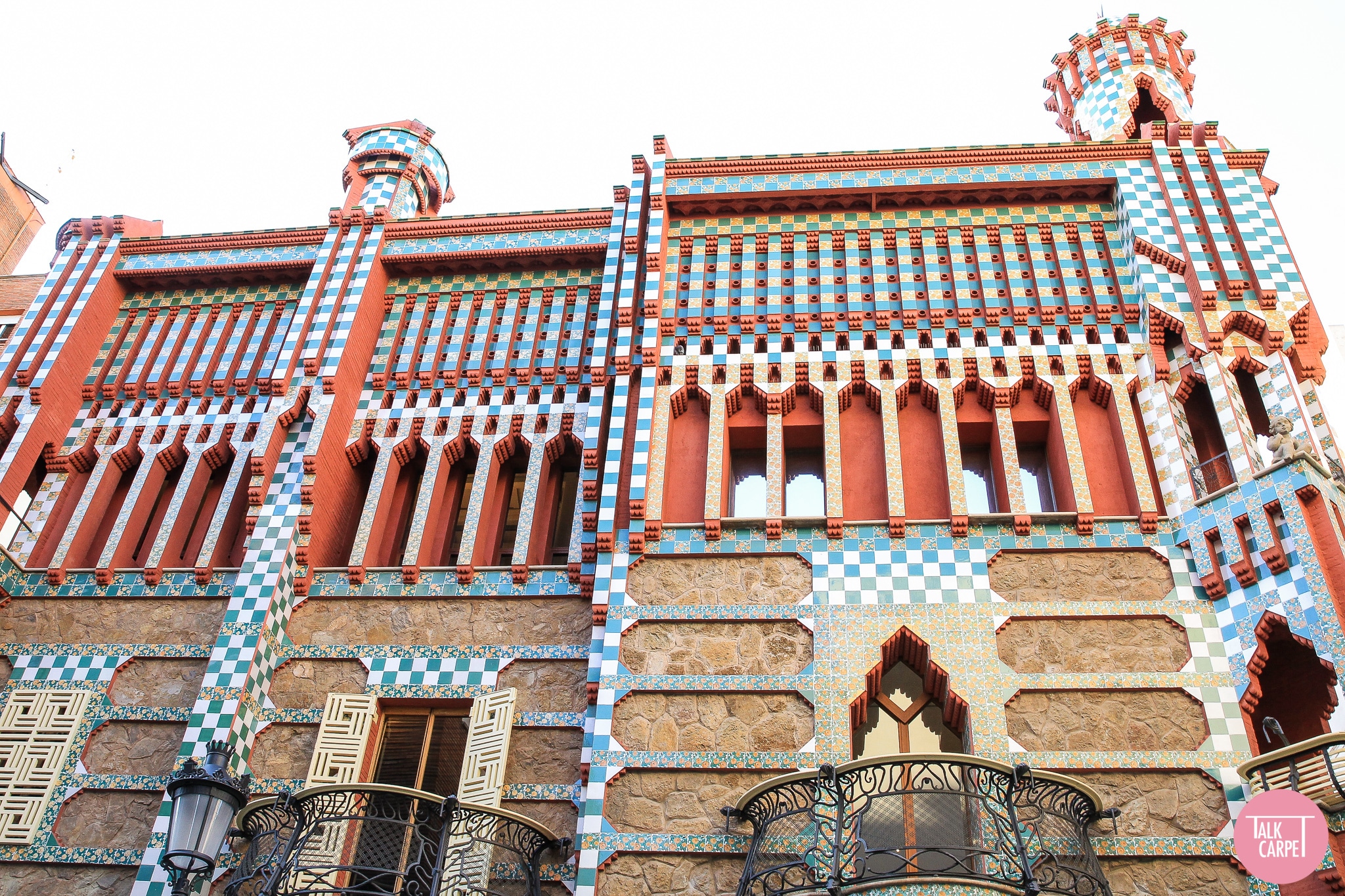
Heading north up the Spanish coast to Barcelona, the trend of bold colors remains persistent. The city is a hub of modernist architecture. Here, the majority of the bright and elaborately patterned buildings are thanks to Antoni Gaudi. His first major project as a young artist was Casa Vicens, an elaborate Modernist house built-in 1883. Inside and out, it features bold colors and tiling, which kicked off the Modernism movement that now scatters the city and is some of the best inspiration for currently trending interior colors.
The Casa Batllo is a prime example. The mosaic-like finish is truly beautiful, using blue tiling and shards of broken glass for a colorful aesthetic. This can easily be incorporated into any interior, tiling walls, and surfaces for instant pizzazz. Park Guell, which offers stunning views of the city and beyond, also has Gaudi influence. A bench designed by Josep Maria Jujol sits at the park’s highest point. Like Gaudi, the designer has used vibrant shards to introduce color to the space. This is a perfect example of how bold color does not need to be overpowering or harshly modern. Instead, it can work in harmony with nature and be used subtly for a more subdued impact. You can discover more about Gaudi’s influence on Barcelona’s Modernist architecture here.
Vibrant Markets, Cemeteries, and Villages
In Guatemala, the same use of bold colors can be seen. For an infusion of vibrant colors and atmosphere, the Chichicastenango Market is a must-see. The market is one of the largest in Latin America, and the streets are lined with stalls selling brightly colored art with tones of hot pinks, royal blues, and splashes of orange. All the goods are handmade using traditional methods passed down through generations. The colors, patterns, and techniques used are therefore closely linked with the culture of the villagers and another great source for uniquely trending interior colors.
In fact, bright and bold colors are deep-rooted in Guatemala’s culture, such as the Mayan traditions on All Saints Day. As part of the celebrations, it is tradition for gravestones and cemeteries to be painted in bright designs as families gather together and celebrate the spirits. Although unheard of in the Western world, the different colors hold significant meaning in Mayan culture. For example, white is representative of purity, whereas turquoise symbolizes protection. By painting gravestones in these colors, Guatemalans believe it will bring them good fortune thanks to connections with the dead.
The colorful streets of this Nubian village in Aswan, Egypt, are also painted to reflect meaning and tell a story. For the most part, the village is lined with vibrant blue tones, which offset the sandy yellow buildings and mud houses. The streets also showcase the talents to locals, many adorned with hand-drawn paintings of traditional Egyptian elements. Using this cultural significance as inspiration for interiors can create highly moving spaces. This shows how the use of bold color adds visual impact and ties to heritage for a deeper emotional connection.
Bright Colors in Art & Photography
Many artists and creatives across the world also use bold colors in their designs. In Cape Town, this is true for many of the pieces created by local artists and designers, which you can read more about here. Of these, Ashanti Design stands out. The company specializes in making vibrant multi-colored beanbags made from offcuts from the textile industry. Each piece is handwoven using traditional African methods yet converging with contemporary style for a unique and bold aesthetic.
The same can be said for the work by Miles Aldridge, showcased in Fotografiska in Stockholm. Aldridge uses vibrant pop art colors such as pinks and greens, which instantly grabs spectators’ attention. Each of his images links to social issues and gets the observer to think about their approach toward life. This visual language is enhanced by color, with each shade strategically selected for maximum impact based on psychology. The same idea can be utilized in interiors, with precise colors that evoke thought and emotion in whoever enters the space.
Interiors Using Bold Colors to Complement Purpose
Many interiors worldwide draw in inspiration from these vibrant environments to create incredibly innovative spaces. One of our favorites is Flame Studios in Johannesburg, designed by Tracy Lynch. Lynch uses different colors in each room to compartmentalize the space, a technique that works well in any multi-room interior. However, the clear similarities with the placement and use of color make for a cohesive finish. She has also used multiple geometric patterns that create an energetic atmosphere when combined with bold colors. As a recording studio, this style complements the space’s intended use perfectly.
In the same way, the Cuadernos Rubio bookstore in Valencia uses color to complement its purpose. This is a kid-focused bookstore, and its primary color palette has an instant retro and nostalgic feel. Upon stepping inside, shoppers are transported back to their childhood. What’s more, kids love the unique use of bright tones. The design team has introduced this use of bold color predominantly through lighting and transparent colored glass. This is an innovative and enticing method for color introduction, making for a playful interior.
Inviting and Vibrant Hospitality Venues
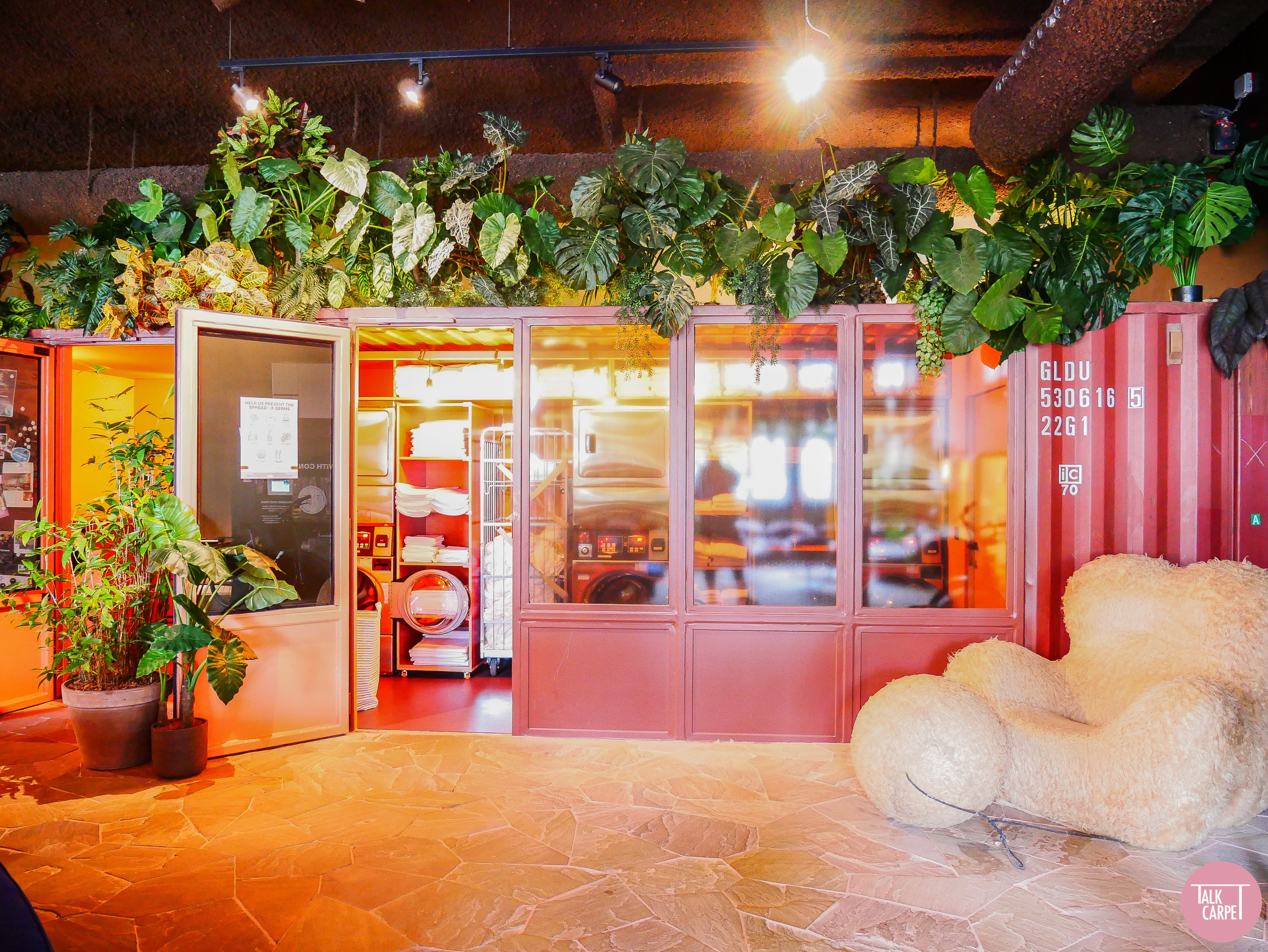
The use of bold colors is further seen in hospitality venues. The hostel, hotel, and co-working space at Yust Antwerp use vibrant tones throughout. These colors transform the industrial old telephone factory into a lively and modern interior. The co-working space stands out the most. Circular blue seating is paired with orange accessories and lighting – a clashing color combination that packs a punch. You can read more about this space here. If adding bold colors to your interior, purple and yellow or green and red have the same clashing yet complementary effect.
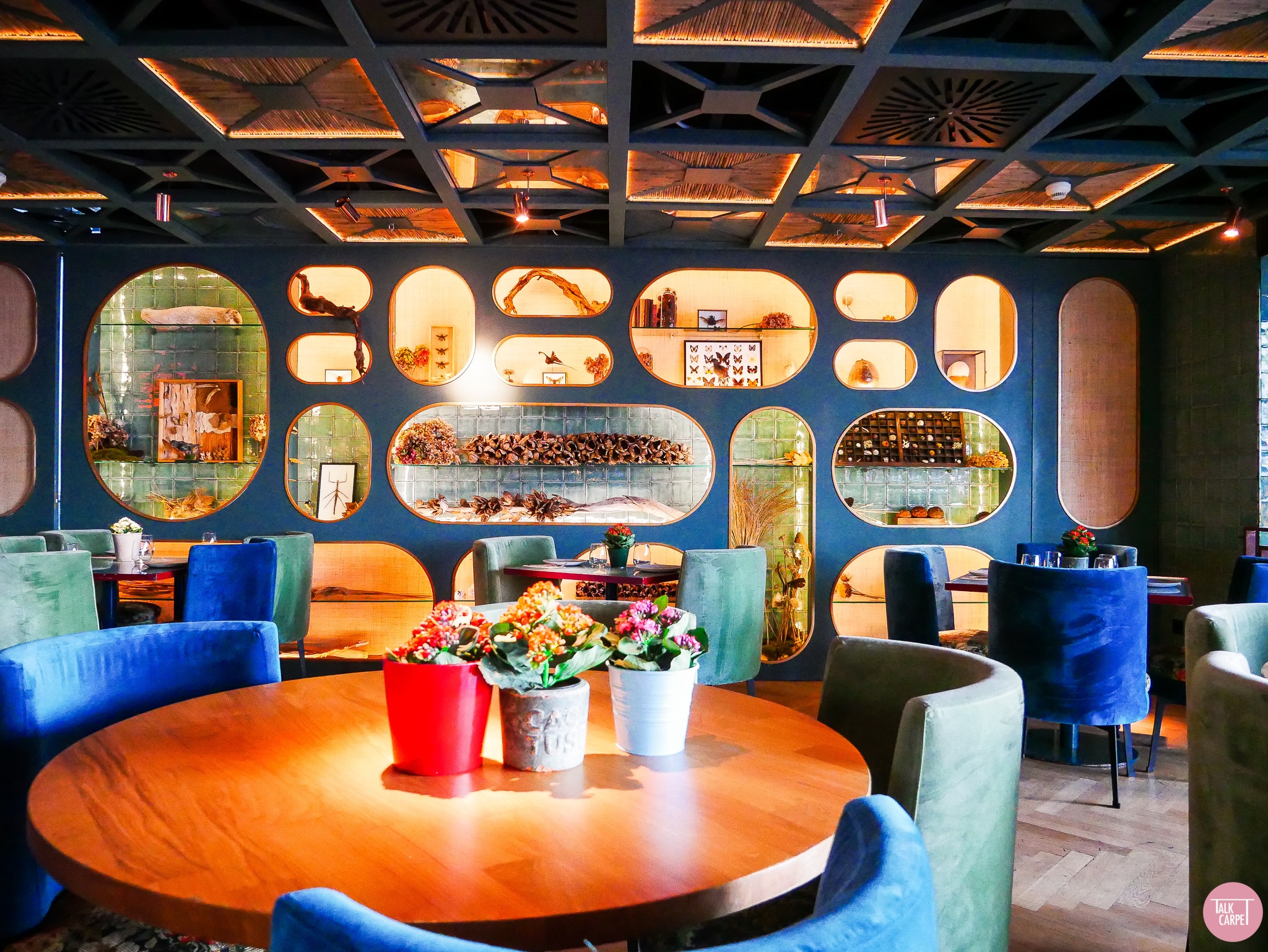
This trio of Madrid restaurants that combine biophilic design with bright tones offers another great example. Sticking with traditional colors such as vibrant reds and yellows, the interiors are distinctly Spanish. However, whereas the Botania restaurant uses brighter tones for a lively atmosphere, New York Burger and Santita have a more relaxed and sophisticated design. The former restaurant achieves this by using mustier and muted tones. On the other hand, Santita uses warm atmospheric lighting for a softer finish. This is a great example of how three spaces following similar design trends and color schemes can have a completely different impact on guests.
Custom Carpets Inspired by Bold Colors
We took inspiration from the buildings on our travels to create some wonderful custom carpets that use bold color. Gaudi’s work was the basis for this stunning blue and yellow carpet pattern. Inspired by his Modernist architecture, we mirrored the lines in the chimneys of his La Pedrera building. We put together in a jigsaw puzzle-like design comparable to his tiles mosaic style and added vibrant tones. It offers a clear parallel with the Modernist movement. Likewise, the interior of a boutique shopping center in Johannesburg helped us design this African corridor carpet. It blends African colors with bold graphics perfectly, ideal for a modern hotel hallway.
We additionally took inspiration from the vibrant artwork seen across the globe. One example is this eye-catching rainbow carpet inspired by Shinique Smith’s fiber rainbow abstract art. Smith uses cultural trends, graffiti, and hip-hop as a starting point for her work, therefore also infused in our design. Rather than making a flat pattern, our designers layered shapes in different tones to add dimension. This shows how color doesn’t have to be flat, and when used in combination with patterns, it creates rooms that feel alive.
Bold Color Mood Boards for Interior Inspiration
Using some of our vibrant carpet patterns as a starting point for your interior, we made several mood boards that lean towards trending bold colors. These can be used for your latest design project for a multi-layered space that pops. For our color-blocking mood board, we paid tribute to Danish artist Malene Landgreen. We recolored a carpet from the graphic collection in pastel tones and layered it with pale blue tiles and material swatches. The result is an eclectic mix of colors that make a statement when used for an interior project. Its lively, playful, and memorable.
Our mood board inspired by Presence in Hormuz is taking a warmer and more raw, earthy approach to the trend. For this, we layered our Grainy Crystal carpet with materials in mustard yellows, rusty oranges, natural greens, and contrasting blues. This palette would work well in any interior that seeks a warming and cozy yet invigorating atmosphere. Thanks to its more earthy shades, it works well for biophilic interiors. Likewise, its contrasting yet harmonizing colors work great when combined in graphic prints and geometric patterning.
Our final blue and yellow mood board are based on rolls of dyed textile yarns seen in Cape Town. Here we selected the Butterfly carpet and recolored it in blue and golden yellow. On top of this, we layered natural and subdued greys and browns in varying textures. This is a prime example of how interiors can be bright and bold by using only one or two colors. You don’t need to use colors from the entire rainbow to make a statement, and sometimes simple yet bold is just as effective. Using these as inspiration for your next project is bound to create a memorable interior that packs a punch and marries that with trending interior colors.


